After receiving feedback about the previous cuckoo-clock design, I was asked to go back to my sketchbook and work on the frozen web idea and use this as my final instead...
I ended up producing six new frozen web designs, allowing me to experiment along the way and chose the most successful as the final "picturing time" illustration.
Later on, I made some of my favourite webs into Christmas cards:
Tuesday 30 November 2010
"Picturing Time" - Frozen Webs
Labels:
amy holliday,
spider web,
time,
webs,
year 3 work
Saturday 20 November 2010
"Picturing Time"
A very open brief to simply create an image that shows time. After many possible ideas I chose to design a cuckoo clock using the rotation of the seasons.
Final piece; A3 watercolour paper
Friday 29 October 2010
Ancient Tree Homes
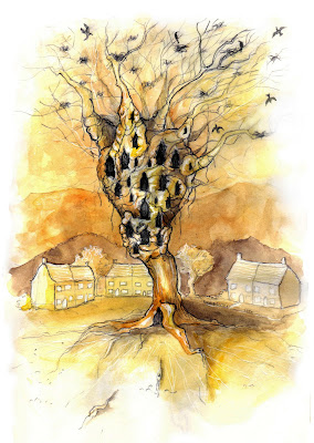
I recently had a very vivid dream and woke with the urge to draw what I saw so I would never forget it! This is one of the scenes.
An enormous, ancient, shell of a tree where people once made their homes stands now abandoned in favor of a modern alternative-the semi-detached brick houses-built around it. The crows feel the structure is still good enough however and so still roost in its bare branches.
There was a few different types in the dream but the two i drew were the most memorable.
"British Firsts" Postage Stamps: Award winning Vegetables!
Brief: Celebrate the idea of 'firsts' and create stamps that inspire the nation whilst instilling national pride.
I chose to focus on British first-prize winners, and from this I chose to further narrow it down to award winning vegetables. I set out making various studies on vegetables that are frequently entered into competitions based on weight, length, best in show etc.
I chose to focus on British first-prize winners, and from this I chose to further narrow it down to award winning vegetables. I set out making various studies on vegetables that are frequently entered into competitions based on weight, length, best in show etc.
Labels:
best in show,
british firsts,
cabbage,
first prize,
illustration,
leeks,
onion,
stamps,
vegetables,
watercolor,
watercolour
Subscribe to:
Posts (Atom)


